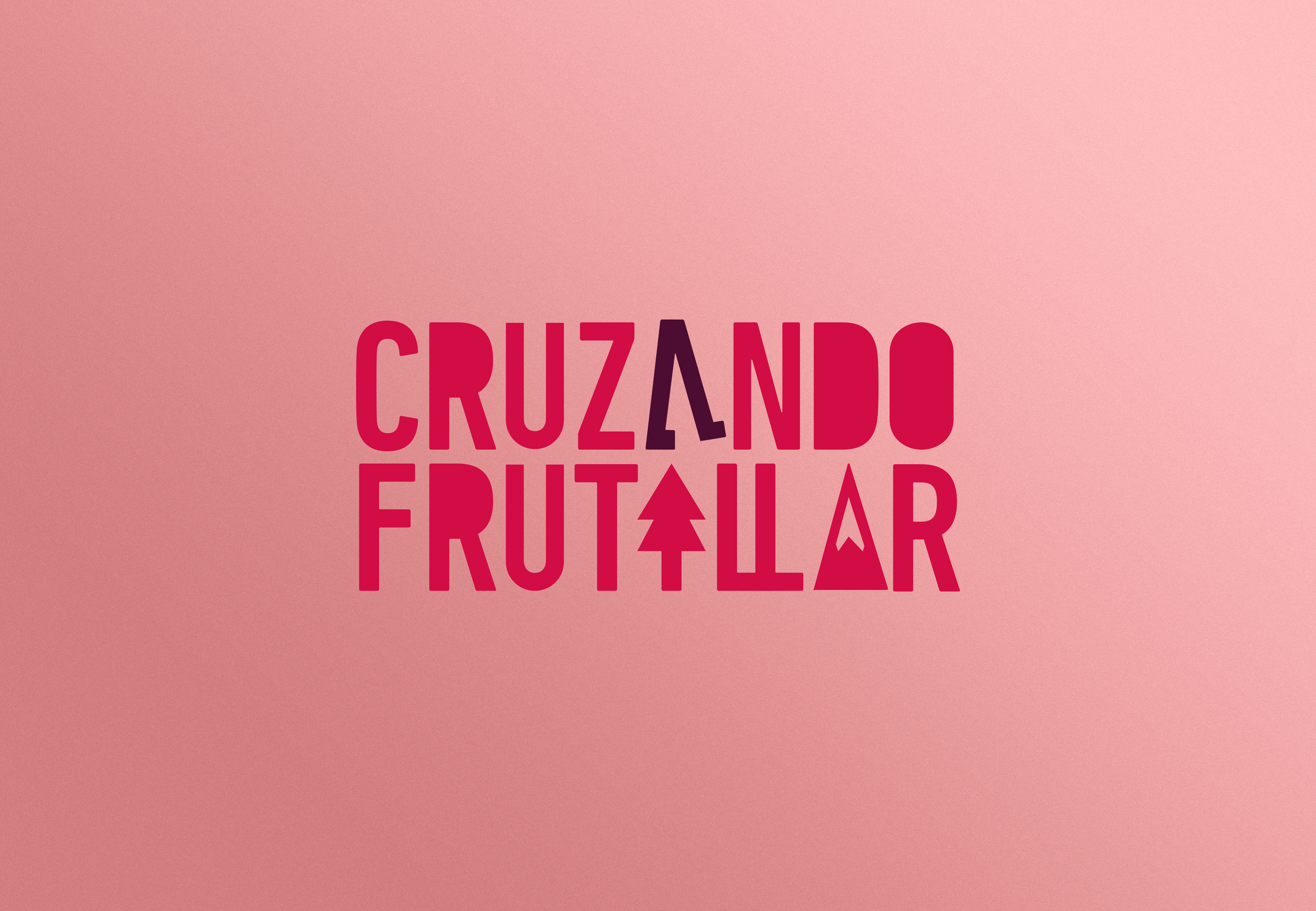
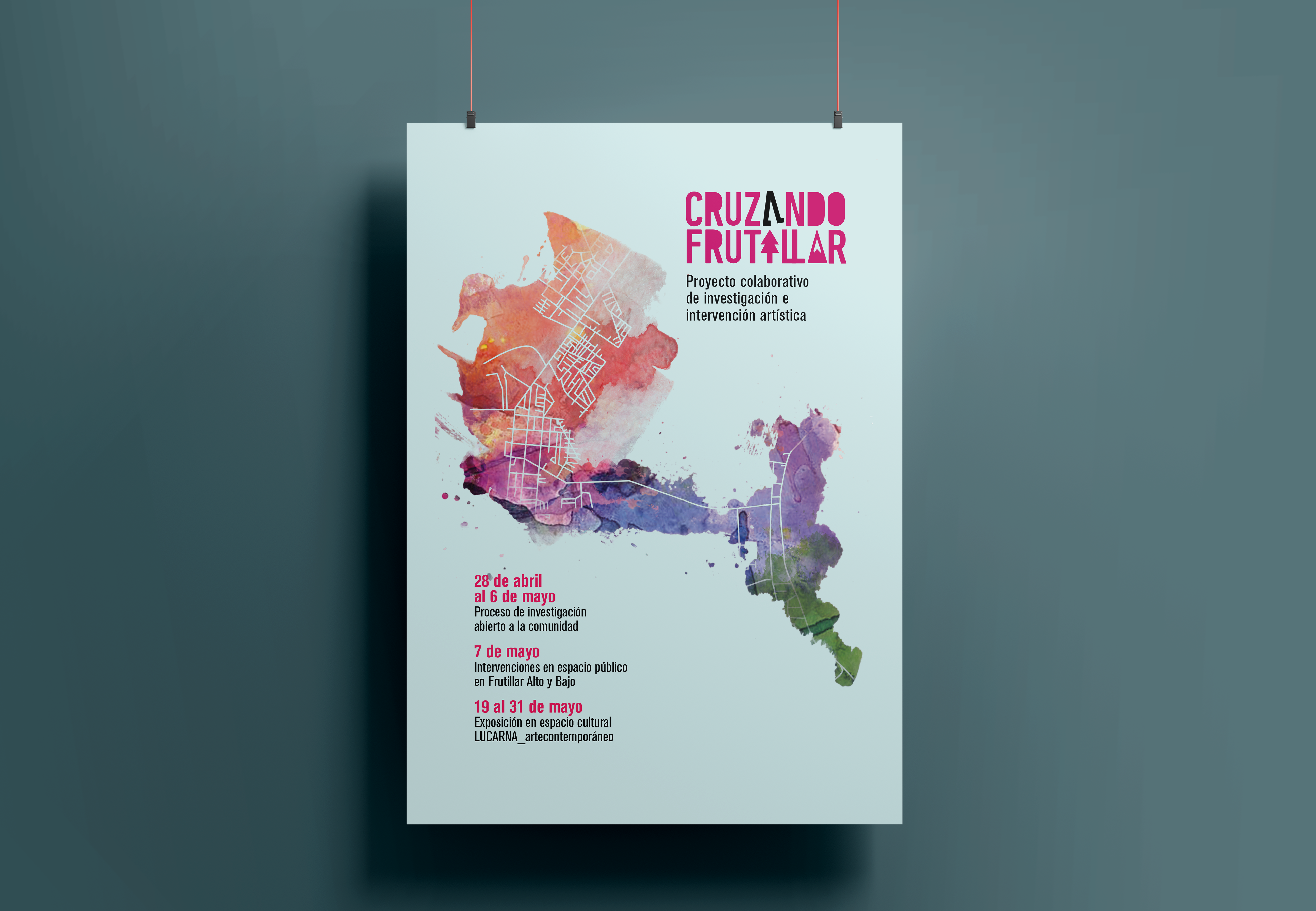
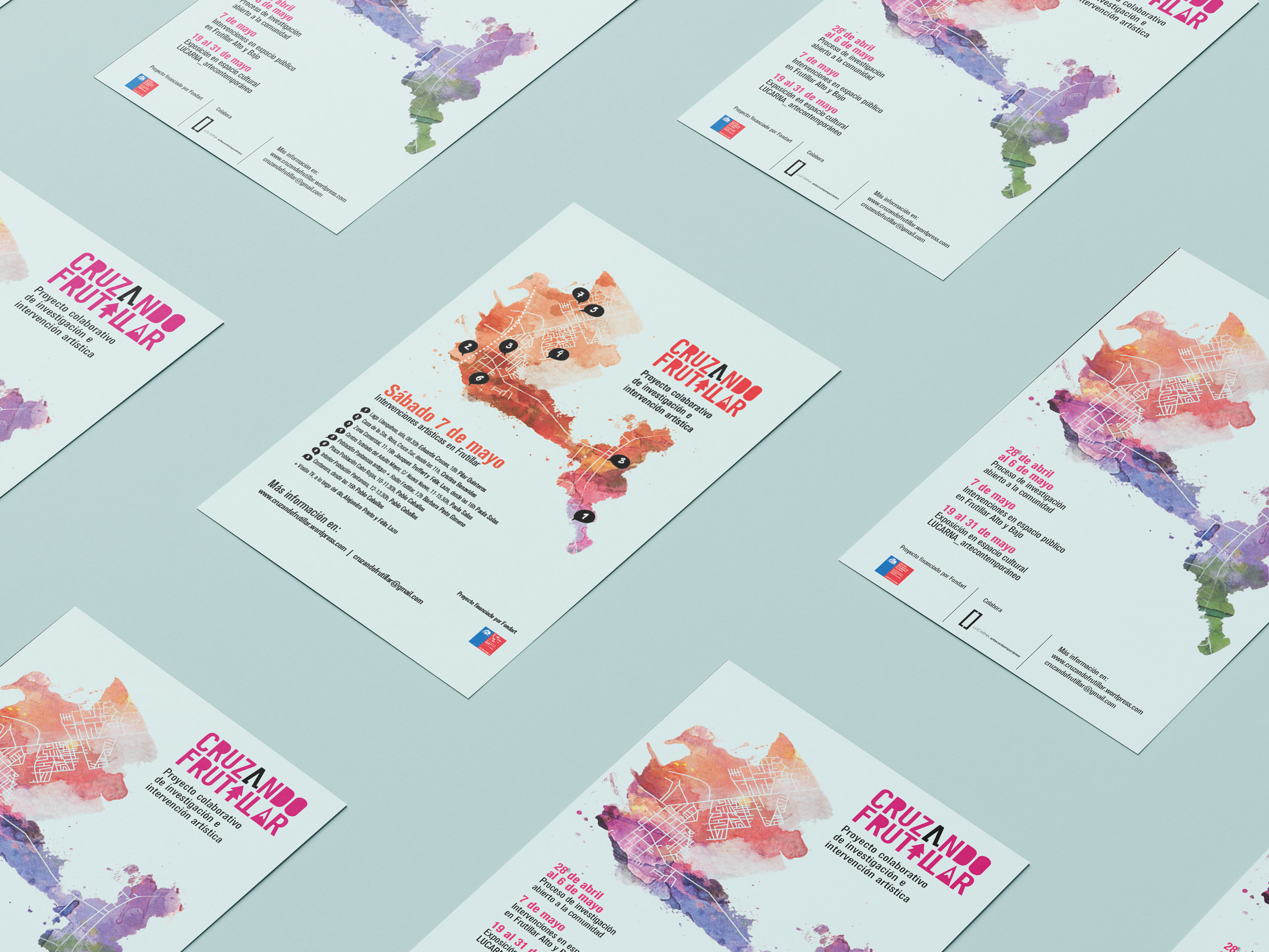
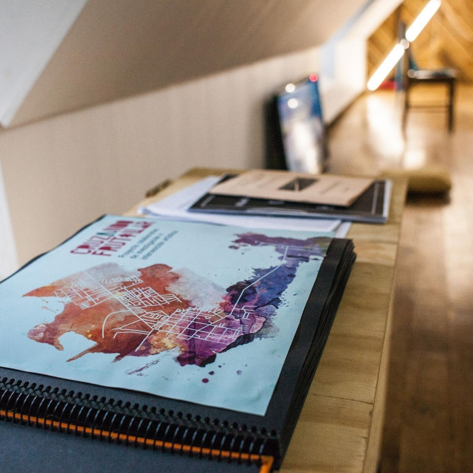
The corporate and graphic image for Cruzando Frutillar, a collective creation experiment through theoretical and performative practices aimed at investigating the socio-cultural identity of Frutillar, has been designed with the purpose of communicating the project’s essence and inviting the public to participate in this unique and enriching experience. To achieve this, a modern and fresh aesthetic has been chosen, combining graphic and typographic elements in harmony with the project’s theme and objectives.
The graphic design has been strategically conceived, taking into account that a significant part of the diffusion will be carried out through digital channels such as social networks and websites. For this reason, an impactful and striking image has been created, with vibrant colors and stylized shapes that attract the viewer’s attention and generate interest.
The corporate and graphic identity of Cruzando Frutillar has been carefully developed, aiming to clearly and coherently communicate the project’s essence. A color palette evocative of the cultural and natural richness of the area has been used, and graphic elements symbolically representing different aspects of the local identity have been chosen. The graphic used is an intervened map, referring to the creation work of the different artists.
In summary, the corporate and graphic image for Cruzando Frutillar is a strategic and carefully designed project seeking to effectively communicate the essence of this collective artistic creation initiative and its objective to investigate and explore the socio-cultural identity of Frutillar.


